Initial Design Question
How can we make the post-match experience more engaging?
Initial Design Question
How can we make the post-match experience more engaging?
Interview And Observation
What are people's attitudes to online dating apps?
of women
of men
have met with someone they first talked to online in real life.
of men
of women
aimed to go on at least one date.
Two Thirds
of Tinder users
were already married or "in a relationship".
of singles
are fed up with dating in 2023 because of ghosting.
of women
of men
made up the current users' gender ratio.
of users
are looking for a relationship.
minutes
is the average time an user spends on the app daily.
The numbers offer us the general dynamic of dating apps including Hinge. To get a more qualitative understanding of the user experience, a needfinding interview was conducted.
Interview tasks:
1. Understanding what features matter when users dating online.
2. Finding out what they liked and disliked about the existing online dating experience.
Participants:
6 participants between the ages of 25 and 33, with a 50:50 male to female ratio.
Interview Questions:
What motivated you to download and start using Hinge?
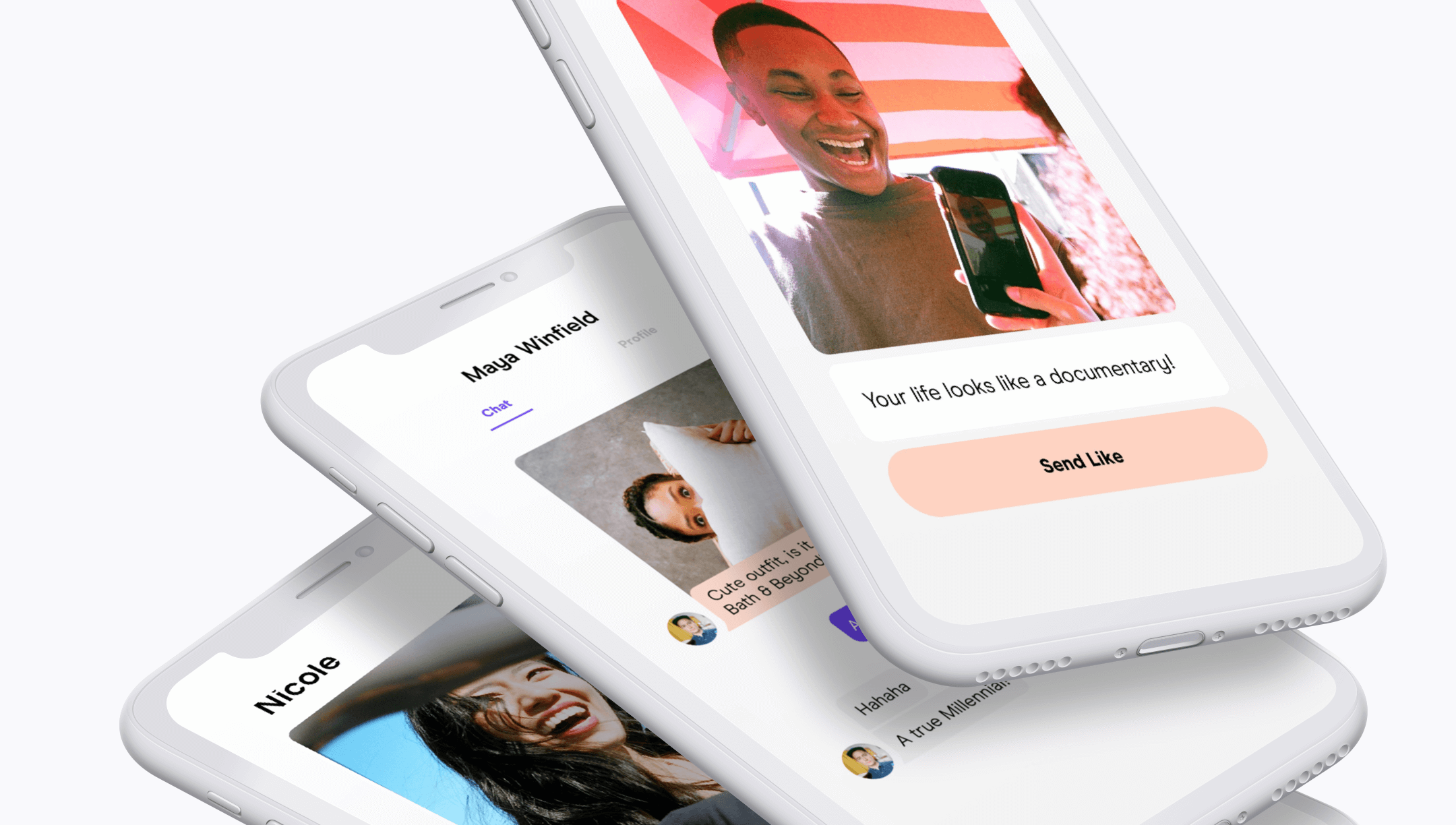
What happens after you match with someone on dating apps?
What happens after you match with someone on Hinge?
Can you walk me through your typical experience using Hinge?
What do you like most about Hinge?
What do you find frustrating or confusing about Hinge?
How does Hinge compare to other dating apps you've used in the past?
Compatible matches
Meaningful connections
Dates
"Nobody talks on the apps."
To be in a relationship
Potential for setting up a date
Convenience, better than real-life rejections
"Profile prompts were useful but conversations can get dry really quick still."
Bots, MLM marketers, low effort profiles
No response, conversation dies out
Swiping exhaustion from seeing the same profiles again and again
"If I don't ask someone out sooner, I can never tell if there's chemistry."
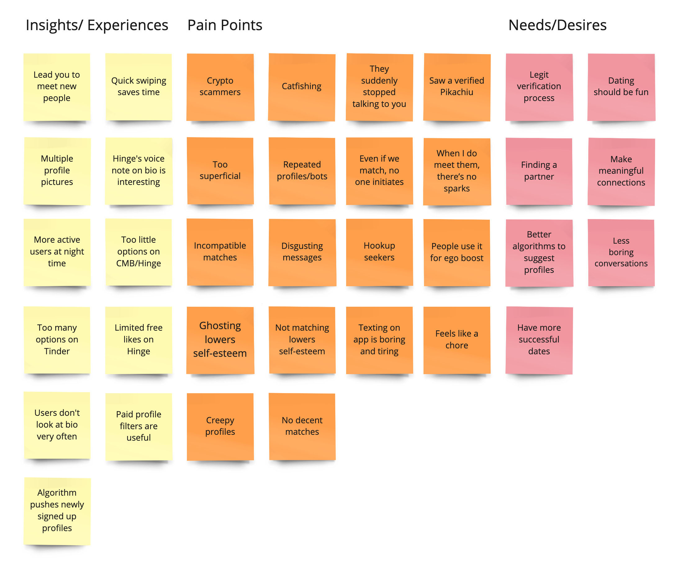
By dividing interview and survey records into
categories for comparison and observation, users' pain points took a larger portion
than their positive or neutral experiences, hinting an overall sense of fatigue and boredom.
By scoping down to pain points, this mapping provides a clearer vision of what to improve and redesign in order to benefit users.
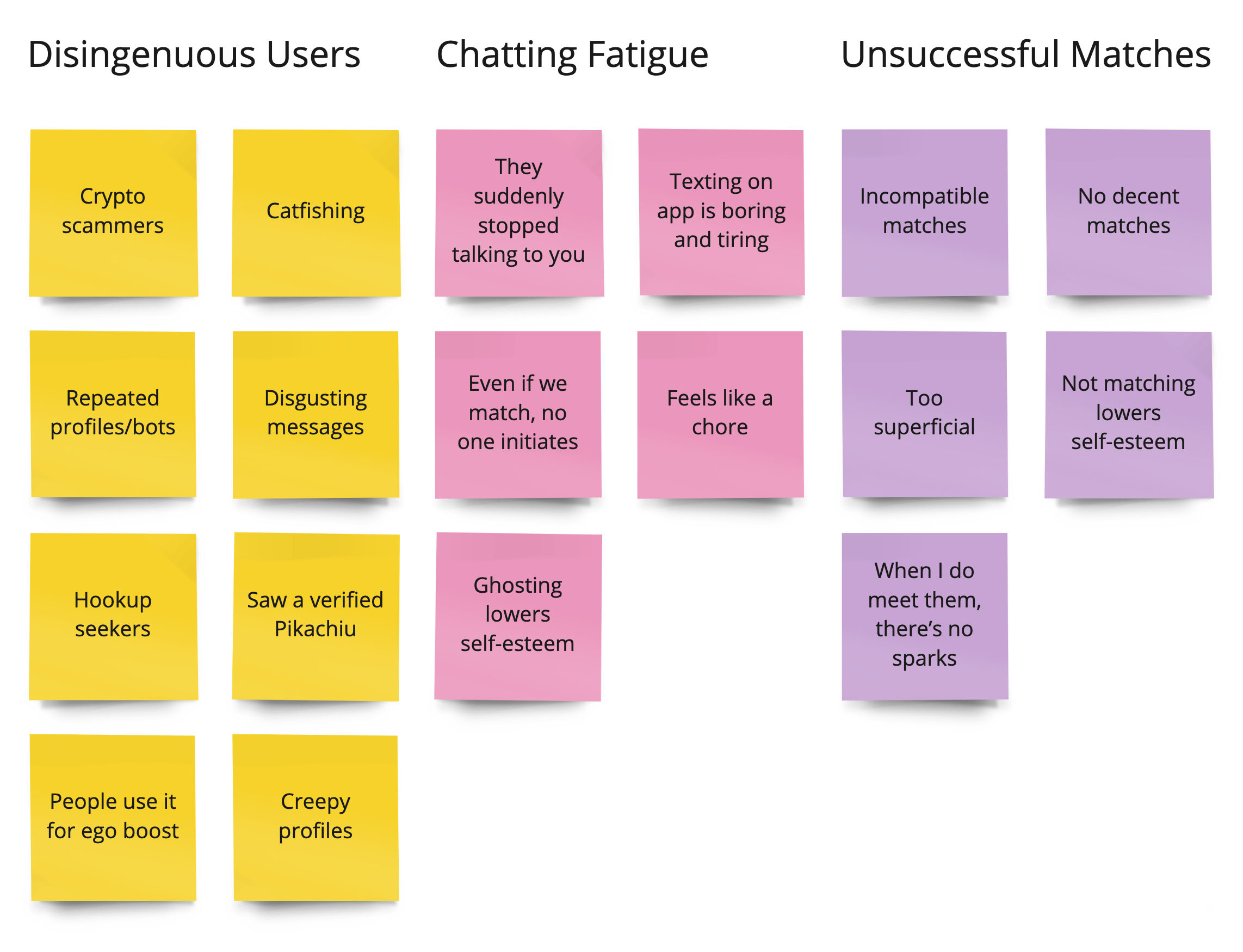
The issue with disingenuous users is most frequently occurred among Tinder users. As this study focuses on Hinge,
we pinned it down to chatting fatigue and unsuccessful matches or dates.
As Hinge is a relationship-focused app, users' ultimate goal is to meet their future partners.
Chats that aren't moving forward as dates pose as a major roadblock. After a series of brainstorming and taking users' fatigue towards dating apps into account,
the design question was reframed to "How can we make the post-match experience more engaging that helps users to set up a date?"
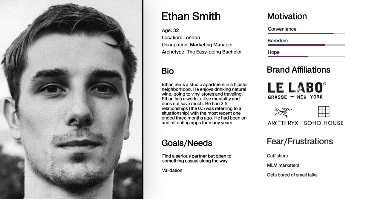
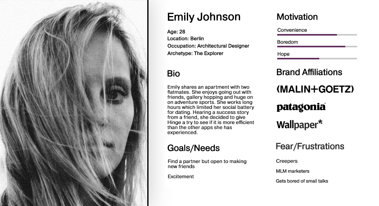
Based on primary and secondary research findings, I created two personas representing Hinge users.
After the Crazy 8's design sprint, a mid-fidelity wireframe was created.
The user flow aimed to simplify the steps required to set up a date — to make the process as frictionless as possible.
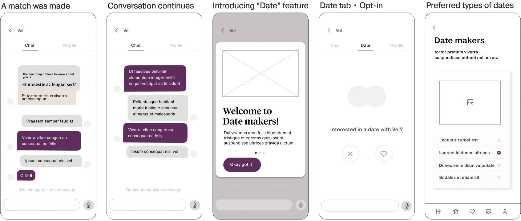
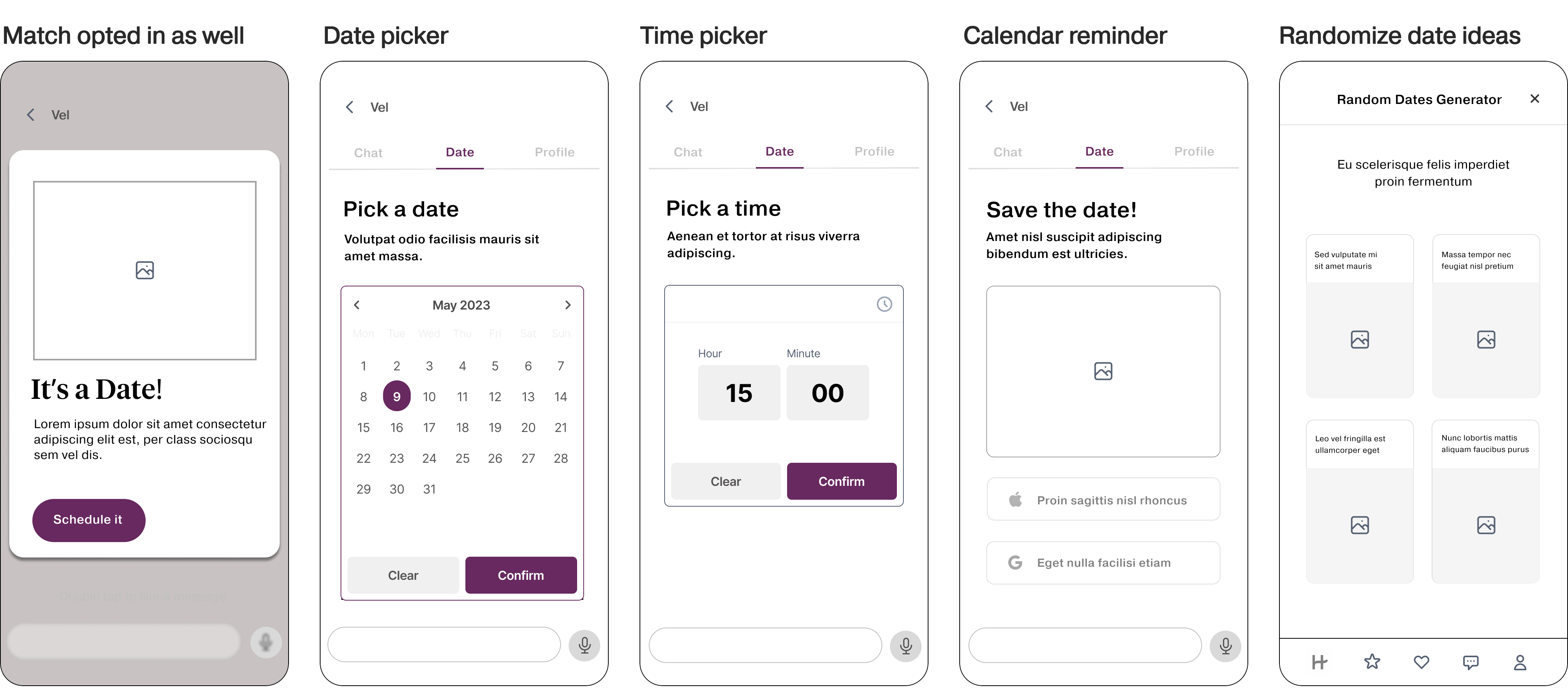
The elements in the existing Hinge UI kit were employed.
Main goals:
1. See if the prototype is intuitive enough for users to navigate.
2. Select the steps or process of the "Date" feature that can be improved in the next iteration.
3. To further dig into the user's attitude and demands for post-match features.
Key findings from feedback grid:
1. Most users struggled in scheduling and cited a need for an "edit" button for re-scheduling.
2. Easy to opt in/out and select types of preferred dates.
3. All of the participants thought positively of the "Date" feature and would like to see it being implemented.
Developing a feature for Hinge was an enjoyable experience, teaching me to work within the app's constraints and use its design patterns to maintain usability. Solid research was crucial, as it helped gather target data and lay a concrete foundation for further steps. Integrating more gamified elements into the feature could be an interesting next step.